A&W Mobile App
Case study of redesigning the A&W App to enhance user experience in menu browsing and the ordering process, emphasizing improvement in order options.

Overview
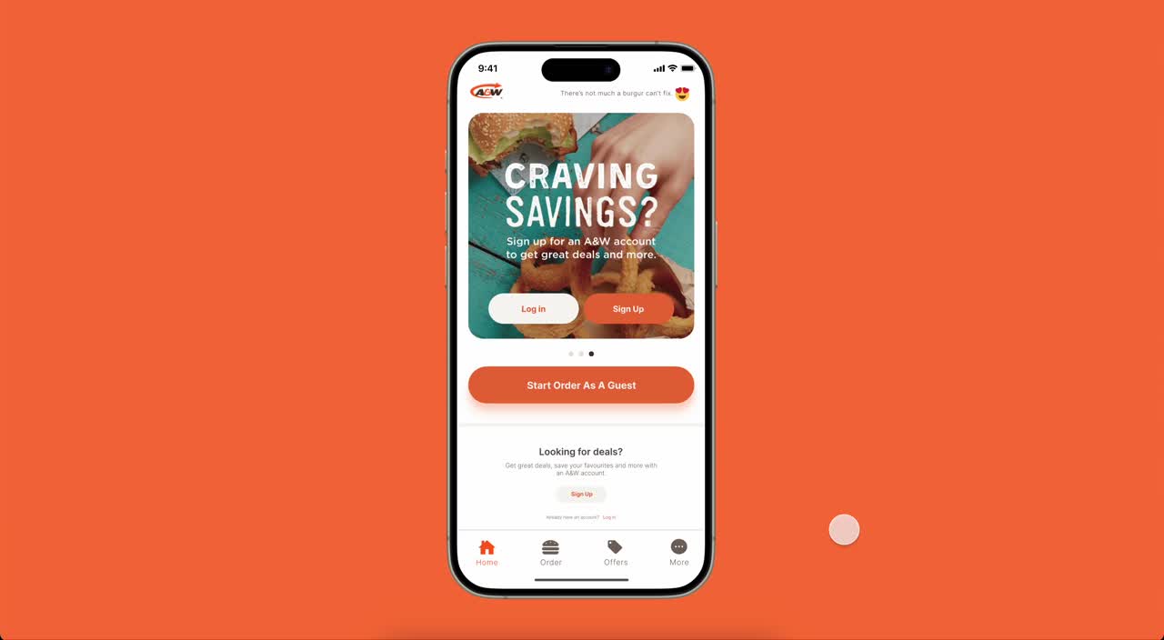
When it comes to fast food, satisfaction hinges not only on taste but also on the convenience of quick ordering. However, browsing the A&W mobile app's menu is not intuitive, and changing order options mid-process is impossible. This can lead to lengthy order times and potential order abandonment.
View PrototypeRole |
UI/UX Designer
Tools |

Duration |
4 Weeks
What were the pain points?
1️⃣ Browsing Menu Before Selection

In the current mobile app, browsing the menu before selecting the store location for the order is not possible. This complicates the user experience, particularly for those who prefer to review the menu beforehand.
2️⃣ Order Type Selection

Before choosing the store location, users must select an order type (dine-in, pickup, delivery). However, changing this option mid-order requires restarting the entire process, leading to unnecessary frustration and prolonging the user journey.
Users' encounters with the current app?
I conducted user tests with the existing app with 5 users. After giving them tasks to perform, I was able to hear about their experiences, emotions, and feedback. This is a visualization of that content in a user journey map:
.png)
Furthermore, I visualized this content once more through the lens of a persona named Miso.

What ideation was there?
Several solutions were derived through the user testing, and low-fidelity wireframes were created to visualize them.

〰️ Adjusted for immediate menu browsing upon navigating to the order page.
〰️ Introduced label-style button for store location selection through pop-up window.

〰️ Positioned map at the top of the popup screen to allow intuitive viewing of store location for ordering.
〰️ Arranged tag-style options for viewing available order options per store.

〰️ Added buttons in the order review stage to enable users to change store location and order type before placing the Place Order. The order option button showcases available order types for each store location.
The solution implementation is complete!
After upgrading the solution from wireframes to high-fidelity wireframes, proceeded to build a prototype.
Reflection & Moving Forward
Originating from subjective experiences, the pain points were expanded upon with more objective evidence through user testing. Based on this, the user journey crafted provided clear solutions to address identified issues. Within the fast-food pre-ordering process, we successfully reduced unnecessary time consumption in non-intuitive menu browsing and order option changes. Moving forward, refining the prototype further to ensure a smoother ordering process experience would be beneficial.